This is the first "Project in Detail" blog I've done about something that wasn't either explicitly web code, or heavily web code with some design enhancement along the way. This time around, I'm documenting the process involved in revamping the logo for Caves of Narshe to celebrate the site's 20th anniversary (on July 31, 2017).

 CoN functioned without a logo for seven full years of the twenty, which speaks volumes to the time and the place on the internet in which CoN began; even a site that was fairly large for the time didn't necessarily have any branding, or if so, it was something that simply cloned the organization's offline brand. I didn't mind back then; at the time, we branded with a nice "simple" logotype in generic Arial Black, and people would land at the site and see the name and know where they were and that was that. To be honest, the impetus to actually create a visual representation of the CoN brand has likely been lost to time, but it's pretty likely that it was just something that I wanted to do as a designer at the time; the middle of last decade was my most prolific time as a graphic designer, to be sure.
Without going too far into the genesis of the original logo, it leveraged aspects of the Final Fantasy series itself, remixed to become an identifiable icon of Caves of Narshe. The original logo, debuting in 2007, featured an illustration of the series' iconic chocobo (a large, usually-flightless, often yellow bird in the vein of an ostrich) over a diamond shape similar to the logo of the Shinra company, a fictional megacorporation from the series' seventh flagship entry. While Shinra includes its name in the diamond in Japanese katakana, for CoN we included instead katakana reading "Colliery Town Narshe," noting that Narshe is a coal-mining town in Final Fantasy VI, from whence the site got its name. The logo started out as a colorful and flat piece, matching a proposed new design that never really materialized; as the logo was modified to better suit the designs that were public facing, the logo ended up adding depth while sometimes still dropping color.
The logotype came largely from a similar style used by the London Underground, one of the most iconic logotypes in history. Other than British influence in my design, there was no greater meaning to emulating this style; however, the implementation with strong upper and lower lines and the large, framing start and end caps worked well visually with the bold lines of the diamond and when placed below the logo, implies a strong visual container for the whole package.
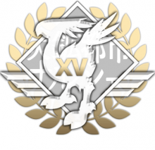
 The logo served its purpose well for ten years, including a stint in 2012 when it was dressed up in gold and silver laurels and wings to celebrate the site's fifteenth anniversary. When it came time earlier this year, though, to address the site turning twenty, I decided that the pillowy, overly affected logo needed more than a different coat of paint, but instead a more radical change.
Room for Improvement
In evaluating the existing logo, I identified a few areas for improvement in terms of a wider redesign.
- Too much depth: Between embossing, shadowing, and opacity effects on various layers, the display with which most users were familiar had too much going on; it was almost too eye-catching. Modern design trends go far more towards simplicity, and nowhere near where the logo was sitting.
- Too many features: Having the Japanese in the background made sense given the origins of the logo, but the site's primary audience does not read Japanese, and while clever, clever is often the enemy of simplicity.
- Difficulty in representation at small sizes: if you're sensing a theme, you're on the mark; the way the original logo was designed and then translated for other uses left the logo difficult to use in small sizes while maintaining clarity, often requiring elements to be fundamentally changed to suit the placement.
- Difficulty in alteration: The original logo was designed between Illustrator and Photoshop, making small tweaks tiresome. A better method would be purely vector, which could also resolve issues in representation.
In short, the new logo needed to be simpler and easier to use for desktop, mobile, and print. After ten years, the overall brand had become known well enough among the audience that I had a lot of room to work along the spectrum between keeping the logo faithful and altering it entirely.
Modification
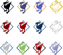
 To do this, the first step was to boil the existing logo down to a sleeker finish. Removing all of the depth and replacing it with negative space wherever possible made the logo immediately easier to re-illustrate in a vector format and output in a variety of finishes, colorways, and sizes. Having done that, it became clear that the extremely faithful replication of the chocobo from the original logo was too complex a shape to fit in with the streamlined background, which by this time had also been stripped of the distracting Japanese. To address this, I redrew the chocobo using the original as a guide, but using broader, sweeping curves and reducing the fidelity of some of the more crowded areas, such as the head and tailfeathers, and the feet. The end result is still easily identifiable for fans, but is more impressionistic at the same time and is generally less harsh, so that the eye can notice it but not be overly drawn to it.
The logotype takes fewer modifications, as its shape and implementation aged more gracefully than the icon. As the original did not specifically come from the same Final Fantasy-specific origin, the primary change to the logotype was in the typeface used; as Open Sans had been moved into the forefront as the font in use for the site five years prior, the logotype was itself updated to match, with only kerning and relative size updated to keep the overall presentation familiar but with added internal consistency.
 In terms of production, the conscious decision to complete all work as vector elements is not only a good practice, it also allowed for rapid expansion to work for all of the website's signature themes, each with its own color scheme. A master version of the logo and logotype exist with a combination of strokes and fills to be easily modified for size and color. This allows for extreme ease-of-use for various placements and sizes, from hero logos in the site's themed headers to favicon and homescreen badges, print output, desktop and mobile wallpaper, and other uses.
The next post will go into detail of how I took this new logo and extended it even further to specifically celebrate the site's 20th anniversary.
- Log in to post comments