Continuing from the previous Project in Detail blog, the first part of the new CoN logo's creation.
Specialization
As mentioned, the genesis of the logo update was the desire to make another special version of the logo to celebrate the site's 20th anniversary. Very few sites, particularly hobby sites, can claim to have survived so long, and I wanted to do something special to commemorate the time spent in development and among the community. Conceptualizing the new, sleek iteration. The new logo adhered to flat design principles, with simpler shapes, negative space, and large color (or colorless) blocks used to create something legible and clean. For the anniversary logo, my preference was to take that building block and make it a bit more gestalt, applying simple and easy to conceptualize additions to make the whole differentiated but identifiable from the norm.
![]()
![]() CoN had done two prior anniversary logos. The first, for the tenth year, was an afterthought, debuted at the same time as the original - it merely added a banner and a Roman numeral "X" below the standard logo, making it difficult for placement. For the fifteenth anniversary, the logo was addressed more sustainably, with the added flourishes mainly contained to the shape of the existing logo, and better integrated for style. That said, while it was a far better specialization than the first, it also exacerbated the overall zeal of its source material, adding in a number of additional gradients, embossings, and shadows to an already-busy design.
CoN had done two prior anniversary logos. The first, for the tenth year, was an afterthought, debuted at the same time as the original - it merely added a banner and a Roman numeral "X" below the standard logo, making it difficult for placement. For the fifteenth anniversary, the logo was addressed more sustainably, with the added flourishes mainly contained to the shape of the existing logo, and better integrated for style. That said, while it was a far better specialization than the first, it also exacerbated the overall zeal of its source material, adding in a number of additional gradients, embossings, and shadows to an already-busy design.
The primary goal, then, of the 20th anniversary logo was to take the clean lines of its new source and build upon them without overwhelming the core improvements described above.
- The anniversary logo needed to be distinctive without taking away from the new logo's impact as a whole, as again they were meant to debut together.
- The anniversary logo needed to maintain the ease of placement established in the source logo - no major changes to the overall shape, no color combinations that would require complete overhauls for various placements, etc.
- Any additions to the logo need to complement the general understated nature of the new logo, with an absence of overbearing effects, animation, or anything else that serves no purpose beyond "look-at-me."
It didn't take long for me to end up at a landing point for this logo, starting from the main thing I liked about the previous one - putting the mark of the anniversary front-and-center on the logo. While at 15 years, I kept a Roman numeral in place at the center of the logo's chocobo, for 20 I elected to go Arabic, using the same Open Sans font now in place for the logotype. A more common usage of the number made it more legible and discernible for the viewer than a "XX" would have been, and also allowed the number to be represented at a slightly smaller, less ostentatious size. Additionally, with the chocobo now more curvaceous, the rounded forms of both the "2" and "0" fit better visually within the shape.
With the desire to keep the logo relatively simple, a lot of embellishments were quickly off the table. No deep shadows, no added depth to the shapes, and so on; really, I wanted to limit myself to additional color and shape while still maintaining goal #2 above. In that regard, several other limitations quickly came into play; for instance, I wouldn't be drawing any large stars or other typical "celebratory" shapes around or behind the new logo to avoid coloring up the lines. I also quickly distanced myself from any linear or radial gradients, as while gradients have long been a feature of the overall site design, they apply too much depth for the goals of this logo. Solid colors could also prove problematic, as they might not work in all placements and also didn't really hit the "special" note as I desired for this logo.
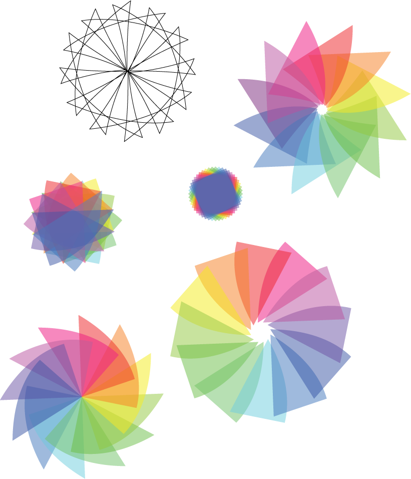 In starting to work with solid colors, though, I began to shape them into combinations that weren't quite gradients but could leverage opacity to create a great spectrum of color. As rainbows are certainly considered to be positive, uplifting images, I realized that creating something along those lines for this logo would very much hit the celebratory note I was going for, and as long as shaped properly, would not create too much depth or action around the basic logo. After a few sketches in Illustrator, I landed upon a general pinwheel shape (also pretty celebratory, and a less common shape!) that was comprised of twelve main colors allowed to overlap at the inside to create a variety of tints. In the image included here, the final pinwheel is shown in the top right.
I applied this shape behind the chocobo and diamond in a few positions and sizes, finally settling upon one with the red tones to the left and blue to the right, with the pinwheel sized so that it only barely had a larger footprint than the foreground. This enabled me to get the visual impact of the spectrum, while keeping placement simple and keeping the overlaying pieces less obvious by putting much of them behind the chocobo. I finished by knocking out the aforementioned "20" to the background, and manually inserting some color to the center of the pinwheel, to connect the design together as a single unit. The final product ends up being something that can replace the original during our anniversary year with virtually no fuss.
Below you can see the final version of the 20th anniversary logo matted to black. It's available in high-res for desktop and mobile wallpapers against both black and white over at CoN!
![]()
- Log in to post comments